This infographic by DegreeSearch shows how much fat the average healthy man and woman carries on their body, how much exercise is needed to burn off the calories in a pound of fat and what that equates to in fast food. Take a look:

This infographic by DegreeSearch shows how much fat the average healthy man and woman carries on their body, how much exercise is needed to burn off the calories in a pound of fat and what that equates to in fast food. Take a look:

This infographic by Hotel Contract Beds is an infographic about our sleeping habits and the positions we sleep in. It goes through habits such as the starfish (taking up space), the hogger (stealing all the duvet), the gadget freak (sleeping with gadgets in bed) and more. Check it out:

This infographic by Free Dating looks at some mating facts about animals such as the moose, the preying mantis and the lion. It also goes through some scientific concepts such as selection, signalling and differentiation. Check it out:

This infographic by Wedo Headboards shows how to fix a broken headboard rather than buying a new one, regardless of the size of the bed. For further instructions, check it out:

This infographic by Broadgate Mainland provides a breakdown of how digital media is made use of by financial PR professionals. It compares the popularity of social media networks in business, compares their use with more traditional media such as telephone and email, and highlights the problems with using Wikipedia in PR. Check it out:

This infographic by Ambit Energy highlights the differences between three types of lightbulbs, including how they work, their estimated annual cost and savings, and shows the staggering difference in efficiency between incandescent and LED bulbs. Take a look:

This infographic by Maxwell Systems provides facts and figures on the initial public offerings (IPOs) of various tech-based companies, mapping their progress (or perhaps lack thereof) during the first few days on the trading floor. Interestingly, it shows what you might have gained or lost if you invested $100 during the IPO of 10 household names, including Microsoft, Amazon and Google. Check it out:

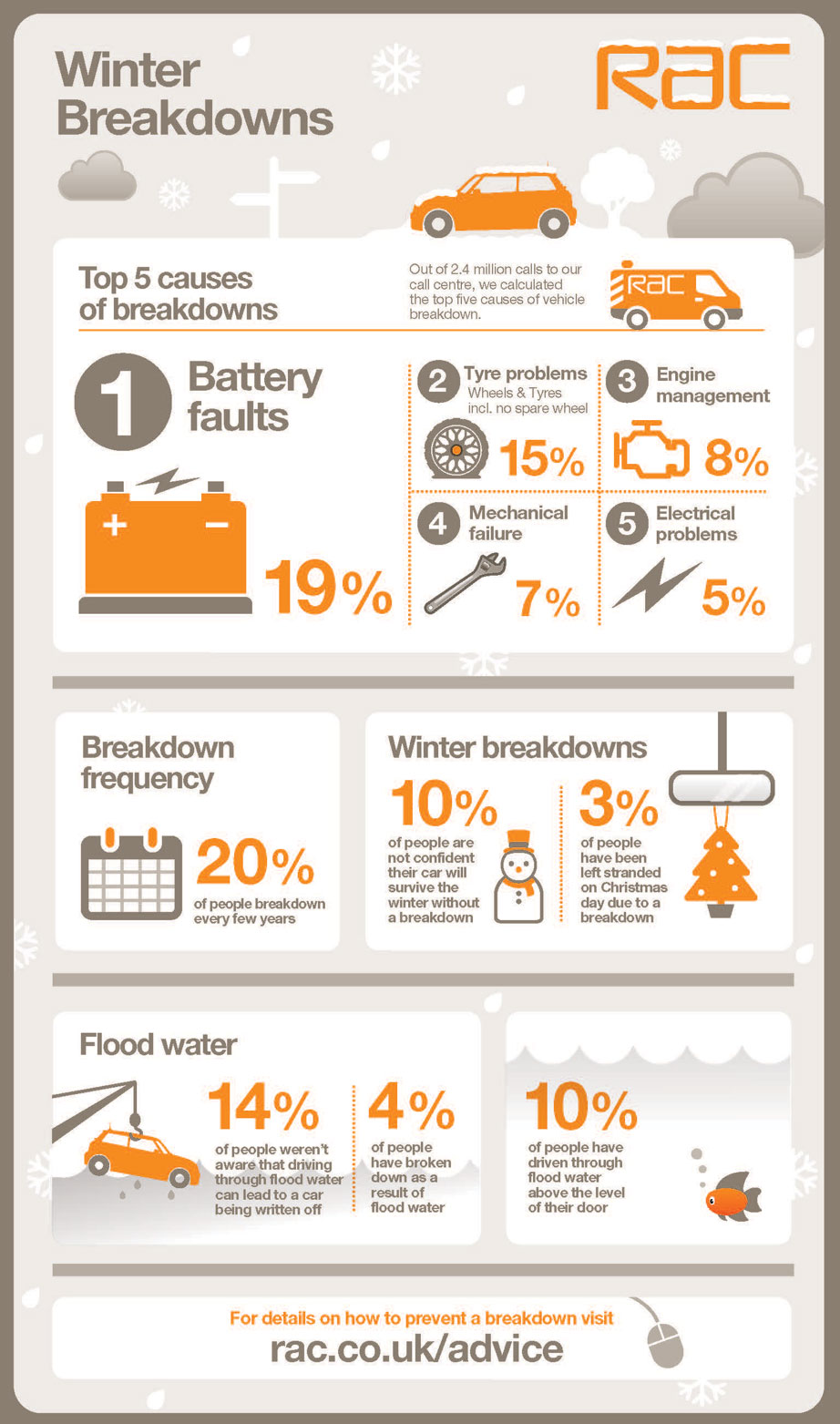
This infographic by RAC looks at winter breakdowns. It takes us through the most common causes of breakdown, gives the proportion of drivers stranded on Christmas day and explains why driving through flood water isn't a good idea. Take a look:

This infographic by The Real Asset Co introduces the men behind China's increase in the accumulation of gold bullion. It introduces men such as Li Yining, Fung Chi Kin and many others. Check it out:

This infographic by When On Earth explains how you can help typhoon victims after the recent typhoon Haiyan. The infographic explains how you can help Haiyan (also known as Yolanda) victims by listing the relevant charities contact details.

This infographic from Typhone gives a history of Samsung mobile phones, showing how the look and performance of phones has changed in the last 12 years, how much time we've spent talking on them, and that phones are often larger now than they were in 2001! Take a look:

This infographic from Syntax provides reasons why your company should consider using Cloud hosting and managed services, citing that it reduced expenditure in 96% of firms and that the Cloud is becoming more and more integral to business strategies. Take a look:

This infographic from UrbanFonts helps you choose when to use serif and sans-serif fonts. Showing the pros and cons of both, it gives reasons why to use one over the other in a certain situations and shows that serifs don't just look fancy, they're there for a reason. Check it out:

This infographic by Profixo introduces some interesting e-commerce statistics. It goes through statistics such as the amount UK consumers spend, how much online sales from social media are expected to grow and much more. Check it out:

This infographic from Indeed shows how 100M visitors use Indeed to find jobs. It shows that it achieves more hires than three of its competitors combined, provides a sample of the jobs it has to offer and shows off many other impressive stats. Check it out:

This infographic by Trucker to Trucker gives an insight into the world of big-rig driving. It provides some stats about the typical trucker, lists some favourite trucking movies, shows some record-breaking trucks and more. Check it out:

This infographic by ORSYP shows how to troubleshoot a DNS error one step at a time. Starting with the most common problems, the flowchart gives clear instructions on how to proceed with finding a solution. Take a look:
