This infographic by Luxhair helps you choose a hairstyle that compliments the shape of your face and highlights your best features. Take a look:

This infographic by Luxhair helps you choose a hairstyle that compliments the shape of your face and highlights your best features. Take a look:
This infographic by Alternate Energy compares the higher cost of electricity in Hawaii with other parts of the United States, gives the cost of installing solar-powered alternative energy solutions and describes the multitude of tax incentives that come with switching to solar power. Check it out:

This infographic by Glow New Media shows how the logos of various well-known brands have evolved over the years, showing the contrast between modern designs and some, such as Ford, IBM and Nokia, which were founded over a century ago. Check it out:
This infographic by Fathom provides statistics on how the internet is used by the over-65s. It charts the increase in smart phone use and social networking, shows a breakdown of popular internet activities and gives tips on how to make websites more senior-friendly. Check it out:

This interactive infographic by DesignBySoap charts the evolution of games consoles, from the Odyssey in 1972, through popular systems like the Nintendo 64 and Playstation 2, up until the present day and the newly released Xbox One and Playstation 4. Each console has a brief description and history, along with the equivalent price if on sale today. Check it out:
This infographic by Car Loan 4U provides some interesting and unusual facts about cars, including the largest speeding fine, which car has a game built into into its computer, why some traffic police carry teddy bears, and where to equip a flame-thrower to discourage would-be thieves. Presumably that's an optional extra. Check it out:

This infographic by Amara takes a look at spending habits over Christmas, showing some of the best-selling gifts of all time, the countries which spend the most money at Christmas, and how age and gender affects how much we shell out for gifts. It also lists the prices of some more luxurious, unique presents such as a life-sized Lego statue, a session with the Harlem Globetrotters and a watch set worth over $1 million. Take a look:

This infographic by 1st Compucare shows how dirty office equipment can get if not cleaned. Perhaps unsurprisingly, telephones and keyboards are the worst offenders, with the average telephone holding 500 times more microbes than the average toilet seat. It shows the most common reasons for equipment being contaminated, how long viruses can survive on the equipment and how dirty equipment affects productivity. Take a look:

This infographic by Serviced shows us what jobs some of the most popular superheroes would take up if they had nothing else to do. If you want to see how Superman would fare as a courier, or how the Hulk would handle being a demolition expert, check it out:

This infographic by DegreeSearch shows how much fat the average healthy man and woman carries on their body, how much exercise is needed to burn off the calories in a pound of fat and what that equates to in fast food. Take a look:

This infographic by Hotel Contract Beds is an infographic about our sleeping habits and the positions we sleep in. It goes through habits such as the starfish (taking up space), the hogger (stealing all the duvet), the gadget freak (sleeping with gadgets in bed) and more. Check it out:

This infographic by Free Dating looks at some mating facts about animals such as the moose, the preying mantis and the lion. It also goes through some scientific concepts such as selection, signalling and differentiation. Check it out:

This infographic by Wedo Headboards shows how to fix a broken headboard rather than buying a new one, regardless of the size of the bed. For further instructions, check it out:

This infographic by Broadgate Mainland provides a breakdown of how digital media is made use of by financial PR professionals. It compares the popularity of social media networks in business, compares their use with more traditional media such as telephone and email, and highlights the problems with using Wikipedia in PR. Check it out:

This infographic by Ambit Energy highlights the differences between three types of lightbulbs, including how they work, their estimated annual cost and savings, and shows the staggering difference in efficiency between incandescent and LED bulbs. Take a look:

This infographic by Maxwell Systems provides facts and figures on the initial public offerings (IPOs) of various tech-based companies, mapping their progress (or perhaps lack thereof) during the first few days on the trading floor. Interestingly, it shows what you might have gained or lost if you invested $100 during the IPO of 10 household names, including Microsoft, Amazon and Google. Check it out:

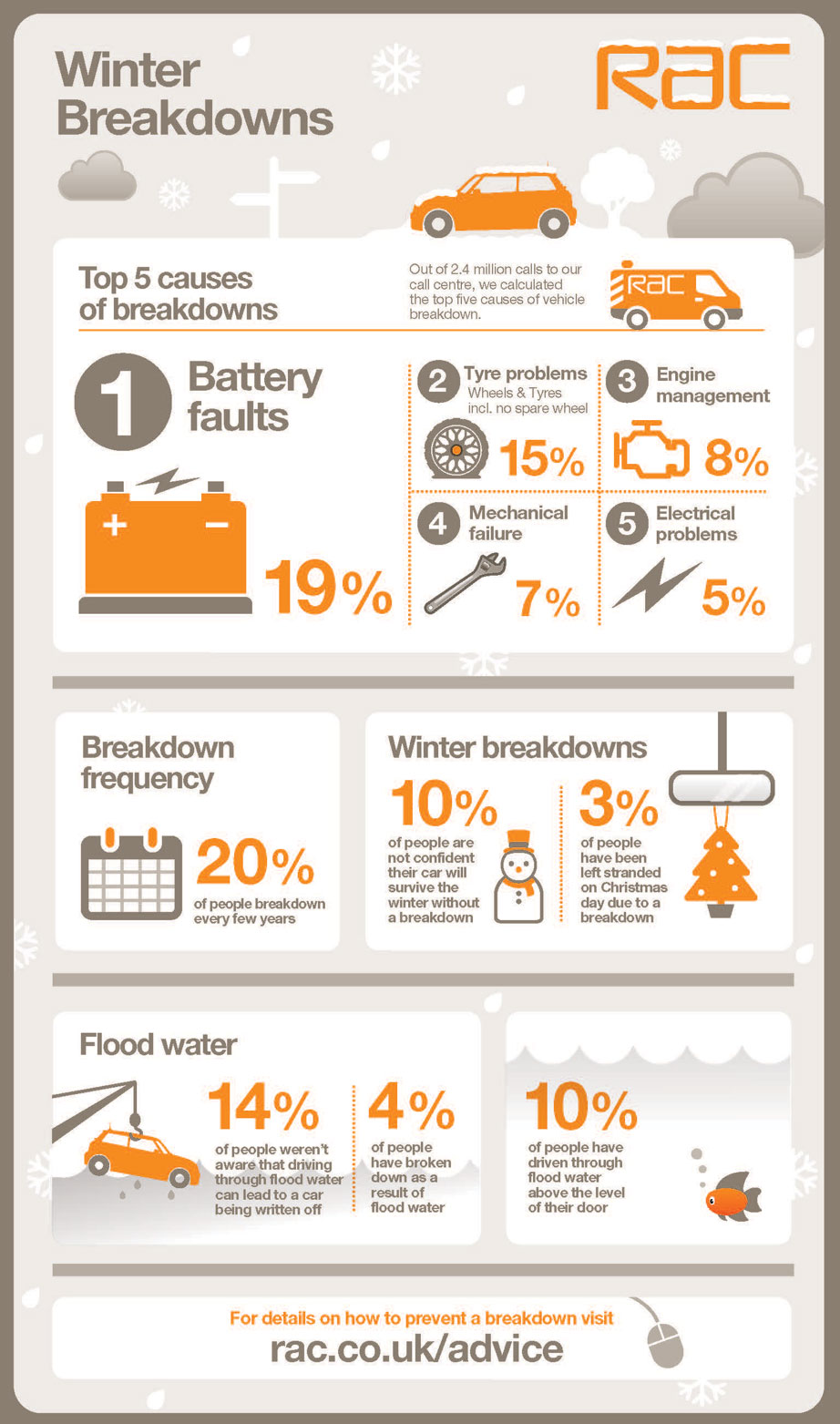
This infographic by RAC looks at winter breakdowns. It takes us through the most common causes of breakdown, gives the proportion of drivers stranded on Christmas day and explains why driving through flood water isn't a good idea. Take a look:
This infographic by The Real Asset Co introduces the men behind China's increase in the accumulation of gold bullion. It introduces men such as Li Yining, Fung Chi Kin and many others. Check it out:

This infographic by When On Earth explains how you can help typhoon victims after the recent typhoon Haiyan. The infographic explains how you can help Haiyan (also known as Yolanda) victims by listing the relevant charities contact details.

This infographic from Typhone gives a history of Samsung mobile phones, showing how the look and performance of phones has changed in the last 12 years, how much time we've spent talking on them, and that phones are often larger now than they were in 2001! Take a look:

This infographic from Syntax provides reasons why your company should consider using Cloud hosting and managed services, citing that it reduced expenditure in 96% of firms and that the Cloud is becoming more and more integral to business strategies. Take a look:

This infographic from UrbanFonts helps you choose when to use serif and sans-serif fonts. Showing the pros and cons of both, it gives reasons why to use one over the other in a certain situations and shows that serifs don't just look fancy, they're there for a reason. Check it out:

This infographic by Profixo introduces some interesting e-commerce statistics. It goes through statistics such as the amount UK consumers spend, how much online sales from social media are expected to grow and much more. Check it out:

This infographic from Indeed shows how 100M visitors use Indeed to find jobs. It shows that it achieves more hires than three of its competitors combined, provides a sample of the jobs it has to offer and shows off many other impressive stats. Check it out:

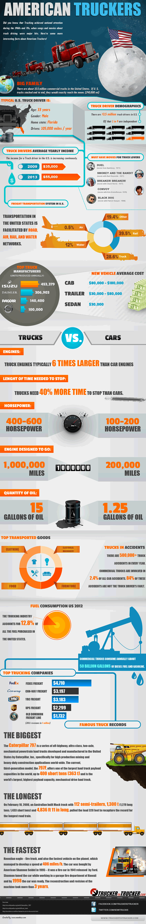
This infographic by Trucker to Trucker gives an insight into the world of big-rig driving. It provides some stats about the typical trucker, lists some favourite trucking movies, shows some record-breaking trucks and more. Check it out:
This infographic by ORSYP shows how to troubleshoot a DNS error one step at a time. Starting with the most common problems, the flowchart gives clear instructions on how to proceed with finding a solution. Take a look:

This infographic from The Tilsun Group helps you choose the right vehicle for surviving a zombie apocalypse. It goes through minivans, sports cars, 4x4s and more. It gives some stats and the pros and cons of each. Check it out:

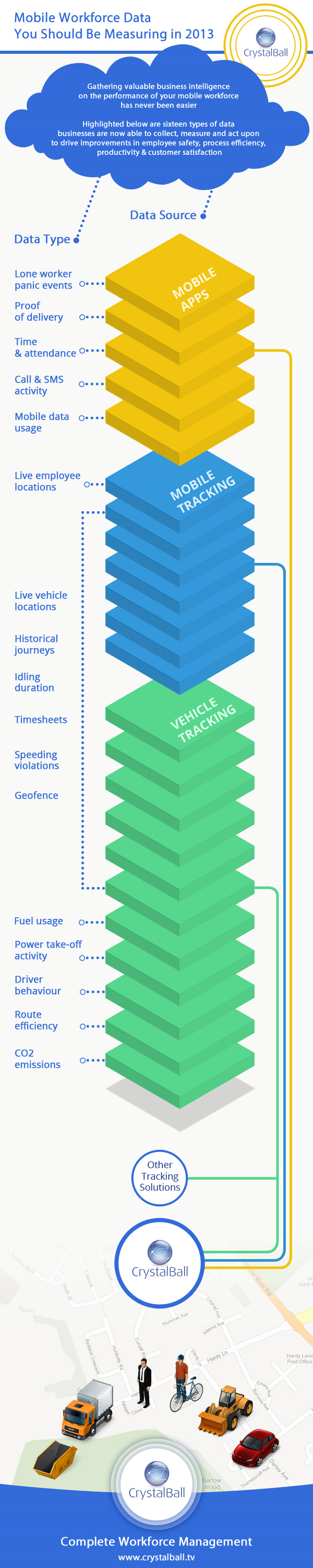
This infographic by CrystalBall introduces 16 types of machine to machine data. Examples of data introduced by the infographic that your business could be tracking are mobile data usage, live vehicle locations and fuel usage. Take a look:
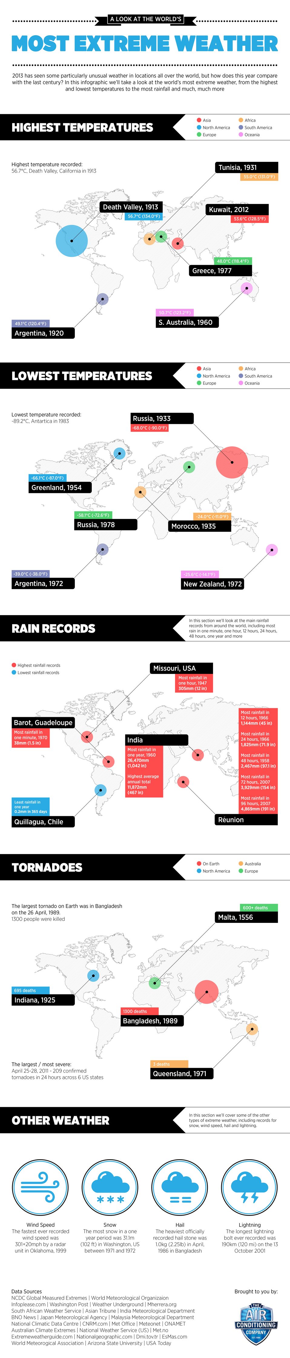
This infographic by The Air Conditioning Company takes a look at the worlds most extreme weather. It goes through highest and lowest temperature, rain records, tornadoes and more. Check it out:
This infographic by Motoring compares some of the features of the Ferrari LaFerrari, the Lamborghini Veneno and the McLaren P1. It goes through cost, acceleration, power and much more. Take a look:

This infographic by Fishfinger is actually about fish fingers. It introduces some interesting facts including the dictionary definition of fish fingers, how to say fish fingers in various languages, nutritional information and more.

This infographic by The Real Asset Co contains a timeline featuring various digital currencies. It talks about currencies such as e-gold and bitcoin. Check it out:

This infographic by Sandy Mount Hotel gives a profile of a modern travel blogger. It goes through the average age of a travel blogger, the gadgets they own, the destinations they visit, how to make money as a travel blogger and more. Take a look:

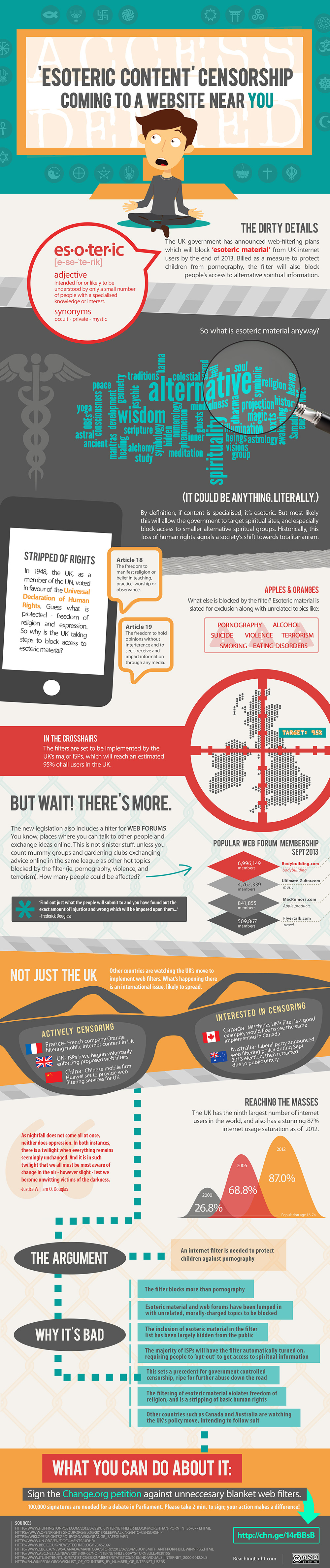
This infographic by Reaching Light talks about the new esoteric filter the UK Govt intends to bring into action. Esoteric is defined as
"Intended for or likely to be understood by only a small number of people with a specialized knowledge or interest."You can fill out a petition to stop this by clicking here.
This infographic by Blu Homes helps you decide whether to renovate or rebuild your home. It weighs up the pros and cons of each, giving statistics on things like cost, resale value and more. Check it out:

This infographic by selfstorage.com takes a look at what the US will be like in 2020. It looks at jobs, population and much more. Take a look:

This infographic by Drexel Online explains that there are 3 vital criteria that online degrees need to meet in order to be viewed equally to traditional degrees and then gives some info to back up those claims. Check it out:

This infographic by Life Quotes 4U introduces eight ways the world could come to an end. From asteroid impact to alien invasion, the infographic tells you the likelihood of each and when they are likely to happen.

This infographic by Rightmove provides a breakdown of house prices across all the regions in the UK. It shows an average property asking price, national asking price trend by property type, and much more. Check it out:

This infographic by MG Legal Solutions provides some tips for people looking to sell their house. It asks whether the price is right, explains that people sell people and brings up some other interesting points. Check it out:

This infographic by Money Supermarket explains the value of a stay at home mum. It goes through some interesting statistics such as the wages they should be paid, the most valuable regions to be a mum and much much more.

This infographic by MG Legal Solutions attempts to make people aware of the dangers of driving. The infographic contains some interesting stats and includes a map showing the areas of the UK where the most drink driving accidents have occured.

This infographic from Direct Villas Florida introduces 50 of the most insane facts about florida. It contains insane facts about geography, laws, theme parks, other attractions and some other random facts.

This interactive infographic from The Air Conditioning Company attempts to make decibels easier to understand. There is a list of different sounds, including volcanoes exploding, the loudest rock concerts and human breathing and if you click on any of these sounds you can hear them through your speakers.
This infographic from Glow Internet goes through sci-fi films that have predicted/influenced the way that computer interface design will evolve. It goes through films such as Lost in Space, Star Wars and The Terminator and talks about the vision and predictions of each.

This infographic from Master Cleaners goes through some of the worlds dirtiest jobs. It includes jobs such as garbage collector, zoo keeper and sewage maintenance and includes a dirty job key so you can easily see why the job is gross. Check it out.

This infographic by Glow Internet presents some facts about smartphones and apps such as the amount of smartphones sold this year, the rise of mobile internet use and the percentage of apps that are free in both the Google play store and the Apple app store.
.png)
This funny infographic from Free Dating tells us why cats are better than men. It gives some reasons why cats are better than your ex-boyfriend, talks about how popular cats are on the internet, and even goes through some signs that might mean you are a crazy cat lady! Check it out:

This infographic (produced by Direct Villas Tenerife) introduces some interesting facts about Tenerife. It goes through information such as population, attractions, the number of tourists who visit per year and more.

This infographic by Shirtworks introduces some of the amazing advances that have been made in the area of computerized clothing. Fabrics discust include a body monitoring jersey, heat generating fabric and a smart shirt that pinpoints the location of bullet wounds.

This infographic by Sprintax is on the topic of foreigners studying in the United States. It goes through some interesting statistics such as where the students are from, where in the states they go to study, their academic level and much more. Check it out: