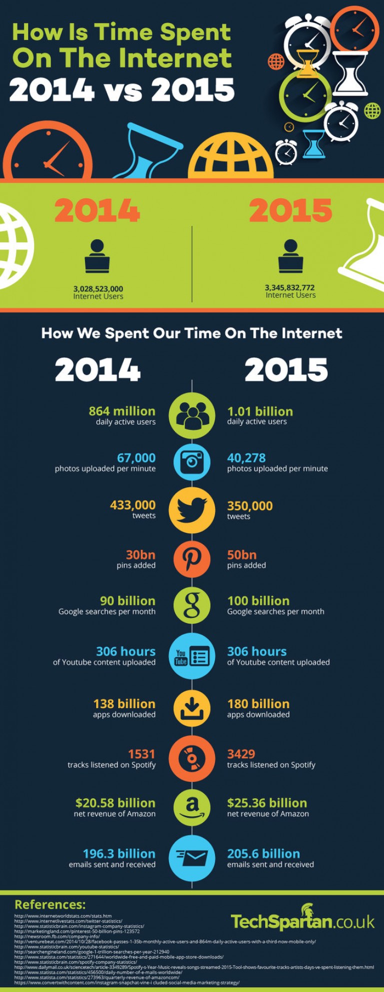
Here is a quality infographic which was created by the technology website called
TechSpartan.co.uk that compares how time was spent on the internet in 2014 to 2015. Infographic includes data about the number of internet users, the number of photos that were uploaded and plenty more.

